

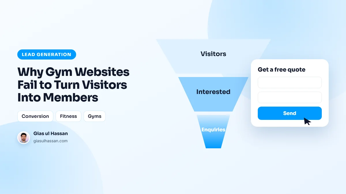
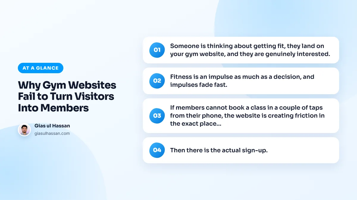
Someone is thinking about getting fit, they land on your gym website, and they are genuinely interested. Then nothing happens. They cannot easily book a class, there is no free trial to grab, and signing up looks like effort, so they tell themselves they will come back later, and later never comes. The interest was real. The website just let it cool.
Why gym websites lose motivated visitors
Fitness is an impulse as much as a decision, and impulses fade fast. The site has to capture that energy while it is hot, which means an obvious, low-commitment next step right in front of the visitor. A free trial, a first class, a tour booking, anything that turns a fleeting moment of motivation into a name in your inbox before it passes.
When I look at gym sites that get visits but few sign-ups, the interest usually leaks out in the same few places:
- No first step. The only options are "join now" or "contact us", and nothing in between for someone who is not ready to commit.
- No idea of price. Visitors who cannot find even a starting price often assume it is too expensive and leave.
- A schedule nobody can read. A timetable posted as a PDF or a photo of a whiteboard is hard work on a phone.
- Joining needs a phone call. The visitor was ready at eleven at night. Reception opens at nine.
Booking and joining have to be effortless
If members cannot book a class in a couple of taps from their phone, the website is creating friction in the exact place it should be removing it. Class booking, clear schedules, and trainer profiles that build a bit of trust all make joining feel easy and the place feel real, rather than a wall of text and a contact form.
Then there is the actual sign-up. If joining means calling during staffed hours or turning up in person, you lose the people who were ready in the moment but will not chase it. Letting someone sign up and pay online, then and there, captures members you would otherwise lose to a busy week and good intentions.
Keep the trial form short
A free trial form needs a name, a phone number or email, and perhaps the class they want to try. Every extra field is another reason to stop. My piece on why visitors don’t fill out your contact form covers field count, button wording and what to say under the button.
What a visitor needs to see before they commit
Joining a gym means walking into a room full of strangers, so people look for reassurance first. A good gym website answers their quiet questions before they have to ask:
- Real photos of the space. Your own floor, equipment and changing rooms, not stock images of models.
- The people. Trainer profiles with a face, a name and what they specialise in.
- The practical details. Opening hours, location, parking and what to bring on the first visit.
- Proof from members. Reviews from real people, ideally ones who started as beginners.
Many people find a gym by searching for one nearby, so the map listing matters as much as the site. Keep your Google Business Profile up to date with the same hours, photos and booking link.
Follow up while the motivation is still there
A trial booking is not a member yet. Send an instant confirmation with the time, the address and what to expect, then have a real person reply the same day. Before the trial ends, follow up with a simple way to join online. Speed matters here the way it does in property; as I note in why most real estate websites never generate a lead, the business that replies first usually wins.
Speed and first impressions on mobile
Most people deciding on a gym are holding a phone. A heavy video banner that takes seconds to load spends their motivation on waiting. Google’s Web Vitals guide explains how loading speed and responsiveness are measured, and both matter when the visitor is one tap from leaving.
First impressions are judged fast in every industry. Law firms face the same problem with anxious prospects, which I cover in the website mistakes costing law firms their best clients. A dated, slow site tells a visitor the business is behind, whatever the reality inside.
Check your own gym website in ten minutes
- Open the site on your phone and count the taps it takes to book a trial or a first class.
- Try to find a price, or at least a starting point, without scrolling through everything.
- Read the class schedule on the phone screen without zooming.
- Submit the trial form yourself and note how long it takes for someone to reply.
- Try to join and pay online outside staffed hours.
Any step that felt slow or confusing to you is far worse for a stranger who was only half sure.
The visitors are motivated. The website either rides that wave or watches it pass. Give people an easy first step and a frictionless way to join, and far more of them become members. I cover how I build these on my gym and fitness website design page, because the difference between a visitor and a member is usually just how easy you made it.